Case Study
Problem:
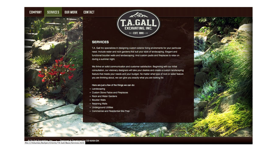
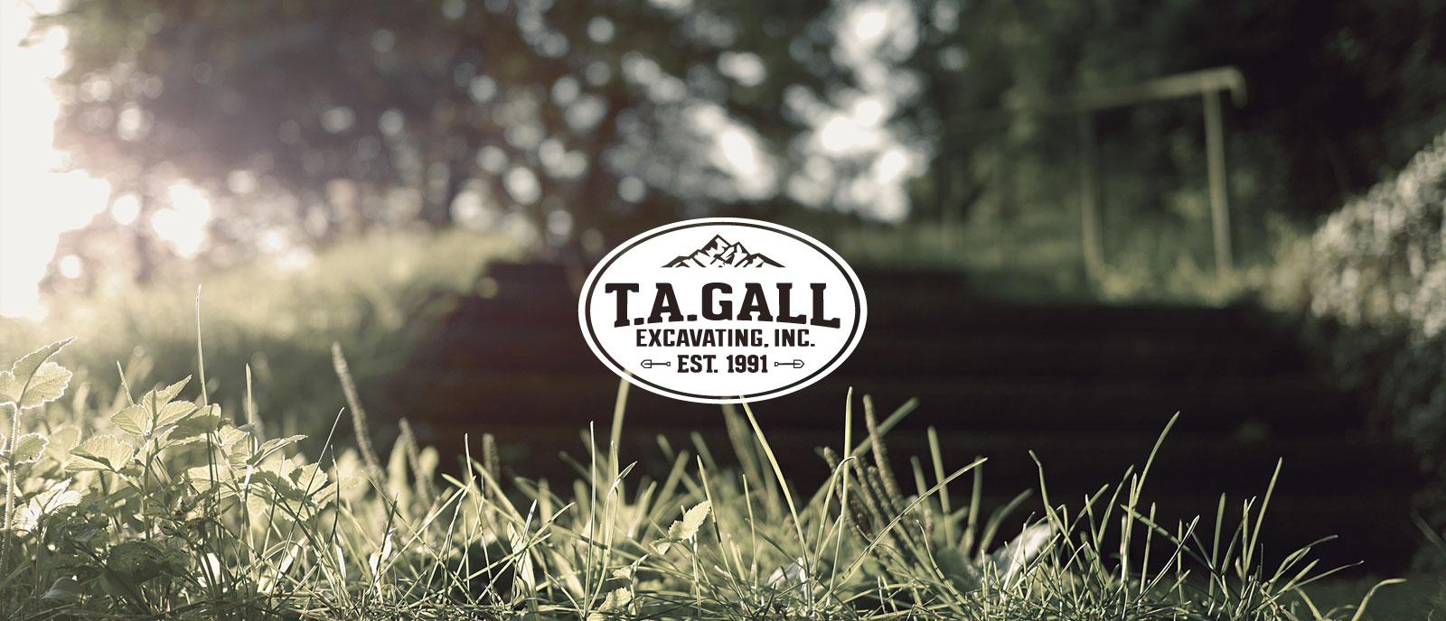
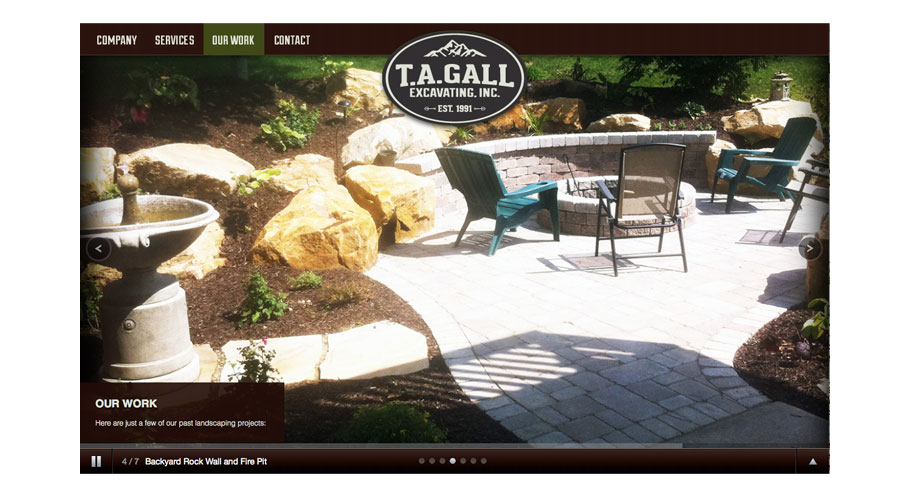
When people think of excavating they think, big machines that dig and push dirt. The guys wear hard hats and make machines lots of noise. We had to make excavating appear high end, refined and natural. This can be a disconnect for high end residential clients. This excavating group is unique because they give a fully customized and friendly backyard atmosphere for water ponds, natural rock walls and rustic fireplaces.
Solution:
The brand identity had to scream established and friendly. For the website we highlight their fully customized work in a nice big photo gallery. No pictures of machines. Nice warm tones and color palette. Three words we wanted people to feel when seeing the logo: Established, natural and classic.
Identity
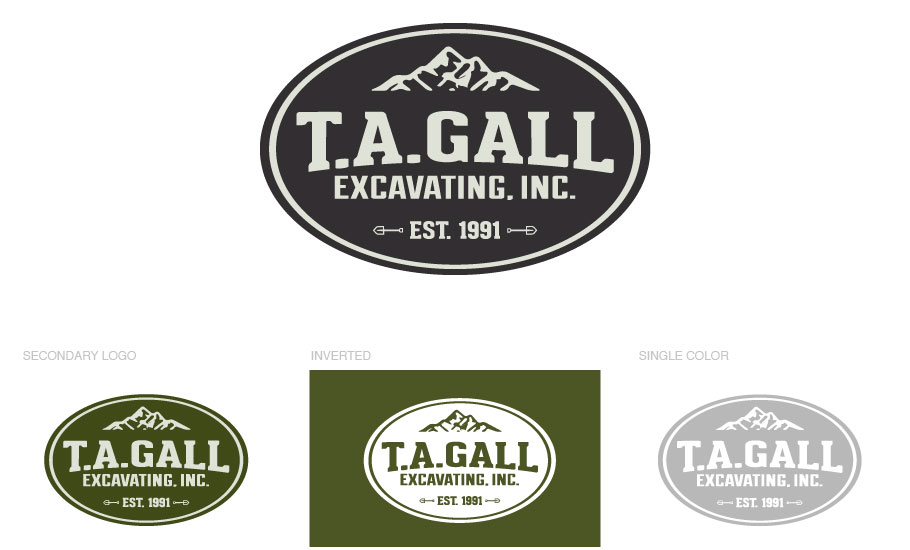
Color Palette

Web Design & Dev
- Home Page
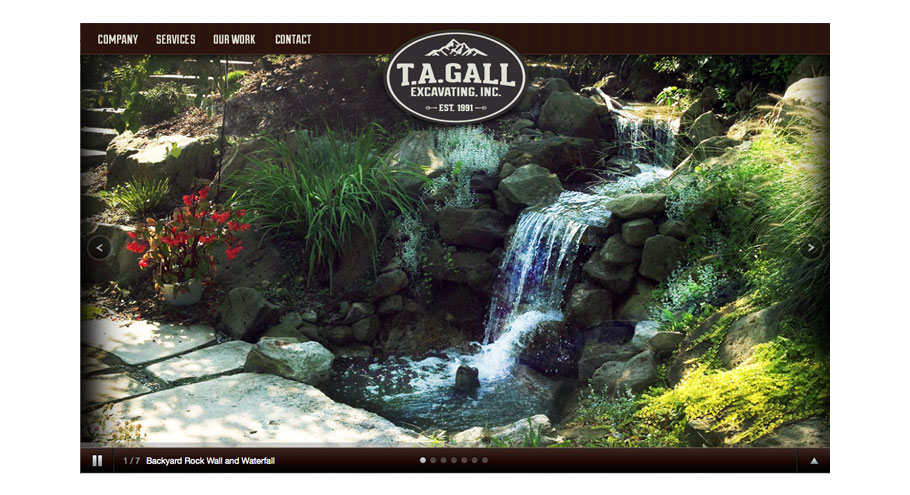
- Portfolio Gallery
- Landing Page